Sunday, June 30, 2013

Better Bird Strike Visualizations with R and ggplot2


Last week I wrote about building some graphs for the FAA Bird Strike Dataset. I used R's built-in graphics capabilities for that work. In this post, I re-do the graphs using the ggplot2 plotting system for R. Why? Because ggplot2 builds upon the features and capabilities of the previous two graphics systems, base and lattice, and improves upon them. It seems to be the graphics system of choice if you are doing any serious R. So in any case, something I thought was worth learning, so I did.

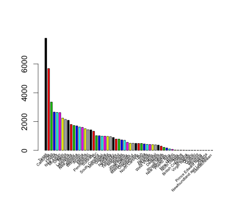
In the interests of time, I will skip over the back story behind the graphs, since I already covered them in depth on my previous post.

The first graph displays the frequency of bird strikes for each of the states in the US in the form of a map. It makes use of a column called Origin.State in the Bird Strike dataset. Here is the code:

1
 2
 3
 4
 5
 6
 7
 8
 9
10
11
12
13
14
15
16
17
18
19
20
21
22
23
24
25
26
27
28
29
30
31
setwd("/path/to/project")

df <- read.csv("BirdStrikes.csv")
df.clean <- df[df$Origin.State != "N/A", ]

library(maps)
library(ggplot2)
library(RColorBrewer)

usa.map <- map_data("state")

# produce a data frame (region, val) where region is the 
# lowercased state name and val is the number of bird hits.
# We want to merge it with usa.map$region
hits.by.state <- as.data.frame(table(df.clean$Origin.State))
names(hits.by.state) <- c("region", "val")
total.hits <- sum(hits.by.state$val)
hits.by.state$region <- tolower(hits.by.state$region)

# merge the bird strike data in
usa.map.with.hits <- merge(usa.map, hits.by.state, by="region", all=TRUE)
usa.map.with.hits <- usa.map.with.hits[order(usa.map.with.hits$order), ]

# plot the data
colors <- brewer.pal(9, "Reds")
(qplot(long, lat, data=usa.map.with.hits, geom="polygon", 
       group=group, fill=val)) +
  theme_bw() +
  labs(title="States by Strike Count", x="", y="", fill="") + 
  scale_fill_gradient(low=colors[1], high=colors[9]) +
  theme(legend.position="bottom", legend.direction="horizontal")

And the graph generated looks like this:


The second graph shows the total cost of the impact by state. In an effort to pack in more information, we use a color gradient to indicate the number of bird hits for each state. So we combine the second and third graphs from the previous post into one here. We also flipped the graph to make it horizontal, that way its also easier to read. Here is the code:

1
 2
 3
 4
 5
 6
 7
 8
 9
10
11
12
13
14
15
16
17
18
19
20
21
22
23
24
25
26
27
28
29
30
31
32
library(ggplot2)
library(RColorBrewer)

# We want to produce a single bar plot where each state is represented
# by a bar. The color of the bar indicates the number of bird hits and
# the length of the bar indicates the cost incurred as a result
strikes <- as.data.frame(table(df.clean$Origin.State))
names(strikes) <- c("state", "num_hits")
costs <- as.data.frame(aggregate(
  as.numeric(Cost..Total..) ~ Origin.State, data=df.clean, FUN="sum"))
names(costs) <- c("state", "cost")
comb.strikes.costs <- merge(strikes, costs, all=TRUE)
comb.strikes.costs <- comb.strikes.costs[
  rev(order(comb.strikes.costs$cost)), ]

# clean up N/A from merged data, and add a state.level field for
# sorting by state name for ggplot. If we use state, ggplot will
# plot with the Alpha list of states, we want it sorted by cost
comb.strikes.costs <- comb.strikes.costs[
  comb.strikes.costs$state != "N/A", ]
comb.strikes.costs <- transform(comb.strikes.costs, 
                                state.level=reorder(state, cost))
comb.strikes.costs <- transform(comb.strikes.costs, 
                                hit.level=cut(num_hits, 9))

# plot the data
ggplot(comb.strikes.costs, aes(x=state.level, y=cost, colour=hit.level)) + 
  geom_bar(width=0.5, stat="identity") + 
  coord_flip() +
  labs(title="Costs by State", x="", y="(Dollars)", fill="") +
  scale_colour_brewer(palette="Reds") +
  theme(legend.position="none")

And our graph looks like this:


Our next graph draws the total bird strikes (ie, across all states) as a time series. The time dimension is given by the FlightDate column. We also compute a trend line using a linear model similar to the previous post and draw it on the graph. Here is the code:

1
 2
 3
 4
 5
 6
 7
 8
 9
10
11
12
13
14
15
16
17
18
19
20
library(ggplot2)
library(RColorBrewer)

# draw line chart of number of bird hits by flight date.
# Convert flight date to Date so we can sort
hit.dates <- as.data.frame(table(df$FlightDate))
names(hit.dates) <- c("flight_date", "num_hits")
hit.dates$flight_date <- as.Date(hit.dates$flight_date, 
                                 format="%m/%d/%Y %H:%M")

# Compute trend line and plot
trend <- lm(hit.dates$num_hits ~ hit.dates$flight_date)
trend.coeffs <- as.array(coef(trend))

# graph the number of hits over date
ggplot(data=hit.dates, aes(x=flight_date, y=num_hits, group=1)) + 
  geom_line() +
  labs(title="Bird Strikes by Date", x="Flight Date", y="#-hits") +
  geom_abline(intercept=trend.coeffs[[1]], slope=trend.coeffs[[2]], 
              color="red", size=2)

And the output is the graph as shown below:


Finally, we want to graph the incidence of various effects as a result of the bird strikes. The effect is given by the Effect..Impact.to.flight column. It is a set of 6 category variables, out of which we discard "Null", "None" and "Other" since they don't appear interesting enough for our analysis. To keep the graph smooth, we rollup the numbers into monthly numbers. Here is the code:

1
 2
 3
 4
 5
 6
 7
 8
 9
10
11
12
13
14
15
16
17
18
19
20
21
22
23
24
25
26
27
28
29
30
31
32
33
34
35
36
37
38
39
40
41
42
43
44
45
46
47
library(ggplot2)
library(reshape2)
library(RColorBrewer)
library(scales)

# roll up flight dates to nearest month. We do this by replacing all
# flight dates to the first of the month, then computing the number
# of days since the epoch (1970-01-01).
df.clean$FlightDate <- as.numeric(as.Date(
  format(as.Date(df.clean$FlightDate, format="%m/%d/%Y %H:%M"), 
  "%Y-%m-01")) - as.Date("1970-01-01"))

# Populate a table whose rows are flight dates and whose columns
# are each category of bird strike impact.
flight.dates <- unique(df.clean$FlightDate)
flight.dates <- flight.dates[order(flight.dates)]
effects <- unique(df.clean$Effect..Impact.to.flight)

# build up the data frame for plotting.
plot.df <- data.frame()
for (flight.date in flight.dates) {
  df.filter <- df.clean[df.clean$FlightDate == flight.date, ]
  counts <- table(df.filter$Effect..Impact.to.flight)
  row <- c(flight.date)
  for (effect in effects) {
    if (nchar(effect) > 0) {
      effect.count <- counts[effect]
      row <- cbind(row, effect.count)
    }
  }
  plot.df <- rbind(plot.df, row)
}
names(plot.df) <- c("flight_date", "NO", "PL", "AT", "OT", "ES")

# graph the number of hits over date. We restrict it to (PL, AT, ES)
# because the others seem unimportant.
plot.df.melted <- melt(plot.df, 
  id="flight_date", measure=c("PL", "AT", "ES"))
# convert the number of days since epoch back to actual dates for 
# graphing
plot.df.melted$flight_date <- as.POSIXct(
  plot.df.melted$flight_date * 86400, origin="1970-01-01")
ggplot(plot.df.melted, 
  aes(x=flight_date, y=value, colour=variable)) +
  labs(title="Impact Types over Time", x="Flight Date", y="#-impacts") +
  theme(legend.position="bottom") +
  geom_line(stat="identity")

And the corresponding graph is shown below:


If you compare the graphics generated in this post to my previous post, I think you will agree that the graphs look nicer and more professional. You may also notice a slight improvement in the quality of the R code. Thats because with ggplot2, it is easier if you can convert your input set to a data frame, so you will probably find the current R code more structured and easier to understand. I also use a few built-in R functions that I didn't know existed before.

Sunday, June 23, 2013

Bird Strike Visualizations with R


One of the assignments at the Introduction to Data Science course at Coursera is to design visualizations using Tableau for the FAA Bird Strike dataset. One big problem (for me) is that Tableau is Windows only, and I have a Mac. So before I used my wife's Windows PC to complete the assignment, I decided to try doing the visualizations in R as a way to understand the data.

I have used R in two previous Coursera courses, namely Computing for Data Analysis and Data Analysis, but I don't get enough practice with R since I much prefer using Python. I guess part of the reason is my familiarity with Python, but I feel that Python as a language is more well-designed and easier to use than R. However, I have been meaning to start using R for a while, and this seemed to be a good opportunity, since graphics are easier with R than with Python+Matplotlib.

The data is provided as part of a Tableau workbook, so to extract the data, I downloaded Tableau on my wife's PC, load up the workbook and export the data to an Excel worksheet, which I then converted to a CSV file using Open Office on my Mac. Now we are ready to answer the questions posed.

How large is our data set?

1
2
df <- read.csv("/path/to/BirdStrikes.csv");
print(dim(df));

This tells us that our data has 10,000 rows and 30 columns. Note that this is a truncated version of the full Bird Strikes data. I could have downloaded the original from the website but it comes as an MS-Access database and I could not get Open Office to read it.

When strikes happen, from where do they originate?

Our data is US only, and we have a Origin.State field which contains the name of the state where the flight originated. For our visualization, we use a map of the USA with the states colored with blue shades to indicate the number of strikes flights originating from them get.

1
 2
 3
 4
 5
 6
 7
 8
 9
10
11
12
13
14
15
16
17
18
19
20
21
22
23
24
25
26
27
28
29
30
31
32
33
library(maps)
library(RColorBrewer)

bsdf <- as.data.frame(table(df.clean$Origin.State))
bsdf$Var1 = tolower(bsdf$Var1)
maxfreq <- max(bsdf$Freq)
usa <- map("state", fill=FALSE)

palette <- brewer.pal(9, "Blues")
name.idxs <- match.map(usa, bsdf$Var1, exact=FALSE)
print(name.idx)
freqs <- as.array(bsdf$Freq)
colors <- c()
for (i in 1:length(usa$names)) {
  stname <- strsplit(usa$names[i], ':')[[1]][1]
  freq <- bsdf[bsdf$Var1 == stname, ]$Freq
  if (length(freq) > 0) {
    col.idx <- round(9 * freq / maxfreq)
    if (col.idx == 0) col.idx = 1
    color <- palette[col.idx]
    colors <- cbind(colors, color)
    print(paste(usa$names[i], stname, freq, col.idx, color))
  } else {
    color <- palette[1]
    colors <- cbind(colors, color)
    print(paste(usa$names[i], stname, freq, col.idx, color))
  }
}
usa <- map("state", fill=TRUE, col=colors)
title("States by Strike Count")
leg.txt <- c("Low", "Avg", "High")
leg.cols <- c(palette[1], palette[5], palette[9])
legend("bottomright", horiz=FALSE, leg.txt, fill=leg.cols)

The image generated by the above code looks like this...


What are the top states in which strikes occur?

Although the shaded map is good for an instant look (and it tells me that my home state of California is the top state for bird strikes, followed by Texas, it does not give a quantiative feel for the data. For that we need a bar chart...

1
2
3
4
5
6
7
8
# calculate counts of bird hits by Origin.State and sort by count desc
bsdf <- as.data.frame(table(df.clean$Origin.State))
bsdf.sorted <- bsdf[with(bsdf, order(-Freq)), ]
bar <- barplot(height=bsdf.sorted$Freq, horiz=FALSE, beside=TRUE, 
               width=c(2,2), space=0.5, xaxt="n",
               col=palette())
text(bar, par("usr")[3], labels=bsdf.sorted$Var1, srt=45, 
     adj=c(1.1, 1.1), xpd=TRUE, cex=0.5)

As you can see, California still leads and Texas follows close behind, although the names of states are a bit hard to read, even with the 45 degree rotation.


We may also want to find out which states end up paying the most for these bird hits. For this we simply calculate the sum of costs (given by the Cost..Total.. column) by Origin.State.

1
 2
 3
 4
 5
 6
 7
 8
 9
10
# calculate sum of costs incurred by Origin.State and sort by cost desc
cidf <- aggregate(as.numeric(Cost..Total..) ~ Origin.State, 
                  data=df.clean, FUN="sum")
names(cidf) <- c("state", "cost")
cidf.sorted <- cidf[with(cidf, order(-cost)), ]
bar2 <- barplot(height=cidf.sorted$cost, horiz=FALSE, beside=TRUE,
                width=c(2,2), space=0.5, xaxt="n",
                col=palette())
text(bar2, par("usr")[3], labels=cidf.sorted$state, srt=45, 
     adj=c(1.1, 1.1), xpd=TRUE, cex=0.5)

and it turns out that Texas incurs the highest cost of bird hits...


Has there been a change in strikes over time?

We have data from January 2000 to August 2001, so we can draw a simple line chart to visualize the change of bird hits over time.

1
 2
 3
 4
 5
 6
 7
 8
 9
10
11
# find counts by flight date
fdds <- as.data.frame(table(df$FlightDate))
fdds$Var1 <- as.Date(fdds$Var1, format="%m/%d/%Y %H:%M")
fdds.sorted <- fdds[with(fdds, order(Var1)), ]
plot(fdds.sorted$Var1, fdds.sorted$Freq, type="l",
     xlab="Flight Date", ylab="Bird Strikes", 
     main="Bird Strikes (daily)")

# compute trend line and place
model <- lm(fdds.sorted$Freq ~ fdds.sorted$Var1)
abline(model, col="red", lwd=4)

This shows us a seasonal trend that peaks around fall each year, probably at around the time birds migrate south for the winter. As shown by the thick red line (fitted using a linear model), bird strikes appear to be trending upwards.


Use the "Effect: Impact to Flight" dimension to investigate.

Even though we know that the number of strikes are increasing, its not clear as to whether this is because we are getting better with reporting or if aviation safety is getting worse. In other words, how many of these strikes result in engine failure or some other serious effect? For this, we use the "Effect..Impact.to.flight" column. It has 6 categorical values, so our initial visualization is to do a scatter plot over time.

1
 2
 3
 4
 5
 6
 7
 8
 9
10
11
12
13
14
15
16
17
18
19
20
21
22
23
24
25
26
27
28
29
30
31
32
33
34
35
36
37
38
39
40
41
42
43
# preprocess and sort data by flight date
df$FlightDate <- as.numeric(
  as.Date(df$FlightDate, format="%m/%d/%Y %H:%M") -
  as.Date("1970-01-01", format="%Y-%m-%d"))
df$Effect..Impact.to.flight <- as.factor(df$Effect..Impact.to.flight)
df.sorted <- df[with(df, order(FlightDate)), ]
# find limits for graphing
ylim.min <- min(as.numeric(df.sorted$Effect..Impact.to.flight))
ylim.max <- max(as.numeric(df.sorted$Effect..Impact.to.flight))
xlim.min <- min(df$FlightDate)
xlim.max <- max(df$FlightDate)
xlim.cent <- (xlim.min + xlim.max) / 2
# colors for graphing
colors <- palette()
idf <- as.data.frame(table(df.sorted$Effect..Impact.to.flight))
i <- 1
leg.txt <- c()
leg.cols <- c()
for (impact.str in idf$Var1) {
  df.subset <- df.sorted[df.sorted$Effect..Impact.to.flight == impact.str, ]
  if (i == 1) {
    print(paste("in plot:", impact.str, colors[i]))
    plot(df.subset$FlightDate, 
         df.subset$Effect..Impact.to.flight, 
         col=colors[i], xaxt="n", yaxt="n",
         xlab="Time", ylab="Impact Type",
         ylim=c(ylim.min, ylim.max), xlim=c(xlim.min, xlim.max),
         main="Impact Types over Time")
  } else {
    print(paste("in line:", impact.str, colors[i]))
    points(df.subset$FlightDate, 
           df.subset$Effect..Impact.to.flight,
           col=colors[i])
  }
  leg.cols <- cbind(leg.cols, colors[i])
  leg.txt <- cbind(leg.txt, impact.str)
  i <- i + 1
}
x.at <- c(xlim.min, xlim.cent, xlim.max)
x.labels <- as.Date("1970-01-01") + x.at
axis(1, at=x.at, labels=x.labels, las=0)
axis(2, at=c(1,2,3,4,5,6), labels=c("UK", "AT", "ES", "NO", "OT", "PL"), 
     las=2, cex=0.5)

Of these, the UK (Unknown), NO (None) and OT (Other) values do not convey any information, except that they are perhaps too minor to document. The interesting categories are AT (Aborted Take-off) in red, ES (Engine shutdown) in green and PL (Precautionary Landing) in magenta. As we can see, Engine Shutdown cases are thankfully not too many to begin with and are actually becoming a thing of the past. Aborted Takeoffs are rising, but not as much as Precautionary Landings.


A better visualization is line charts. As before, we roll up the data into months for each impact type. We remove the Unknown, None and Other impact type values since they don't convey any useful information (and it messes up our scales as well :-)).

1
 2
 3
 4
 5
 6
 7
 8
 9
10
11
12
13
14
15
16
17
18
19
20
21
22
23
24
25
26
27
28
29
30
31
32
33
34
35
36
37
38
39
# roll up by YYYYMM, so we convert the FlightDate to that
df$FlightDate <- as.numeric(format(as.Date(df$FlightDate, 
                            format="%m/%d/%Y %H:%M"), "%Y%m"))
# subset and roll up counts for each impact type
impact.types <- as.data.frame(table(df$Effect..Impact.to.flight))
# we visually figure out the ymin and ymax values for all impact types
ylimits <- c(0, 60)
i <- 1
colors <- palette()
for (impact.type in impact.types$Var1) {
  if (nchar(impact.type) > 0 &
      impact.type != "None" &
      impact.type != "Other") {
    df.subset <- df[as.character(df$Effect..Impact.to.flight) == impact.type, ]
    df.count <- as.data.frame(table(df.subset$FlightDate))
    if (i == 1) {
      print(paste("in plot:", impact.type, colors[i], 
            min(df.count$Freq), max(df.count$Freq)))
      plot(as.numeric(df.count$Var1),
           df.count$Freq, type="l",
           col=colors[i], xaxt="n",
           xlab="Time", ylab="#-impacts",
           ylim=ylimits,
           main="Impact Types over Time")
    } else {
      print(paste("in line:", impact.type, colors[i], 
            min(df.count$Freq), max(df.count$Freq)))
      lines(as.numeric(df.count$Var1), 
            df.count$Freq,
            col=colors[i])
    }
    i <- i + 1
  }
}
x.at <- c(1, 20)
x.labels <- c("2000-01", "2001-08")
axis(1, at=x.at, labels=x.labels, las=0)
legend("topright", c("AT", "ES", "PL"), 
       fill=c(colors[1], colors[2], colors[3]), horiz=TRUE)

The resulting graph confirms our observation that Engine Shutdown is no longer an issue, and that Aborted Takeoff and Precautionary Landings are on the decline as well.


How does it compare to using Tableau?

Well, to give Tableau due credit, its very nice once you get the hang of it. I had trouble because I could not find the sidebar menu (which is needed to do almost anything, and which for reasons unknown was turned off by default - I had to go into the Windows tab and turn it on. Once I got that, I was able to complete the assignment - basically the answers to the questions posed above plus one question you had to think up for yourself and answer it - in under an hour. In comparison, doing the same thing in R took me approximately 5-6 hours (although I am guessing that number will decrease as I become more fluent with R).

That said, Tableau is neither free nor multi-platform. It runs only on Windows, although that may change to include Linux and Mac users in the future. Second, I was on a teaser (but fully functional) version. So you need to like it enough to want to (or cajole your employer to) pay for it. For the moment, I think I will stick with R.

Sunday, June 09, 2013

Functional Chain of Responsibility implementation in Scala


The Chain of Responsibility pattern can be very useful for building configuration driven pipeline style applications. We have made extensive use of this in both our search and indexing pipelines, and because we are a Java shop, our implementation looks a lot like this.

Recently, I was trying to port some of this stuff over to Scala. Now the Scala style favors immutability, which goes kind of counter to the Chain of Responsibility idea, since each command object in the pipeline gets a whack at the processing object passing through it, potentially mutating it.

One way to work with immutable objects is to think about this in a recursive way. Consider a pipeline of command objects (or Functions, since Functions are a first class concept in Scala) fs = [f1, f2, f3, ...], which successively operate on a processing object x. In pseudo-code, the Java approach would look like this:

1
2
3
x = initial_value
    for f in fs:
      x = f(x)

which can be rewritten thus:

1
2
3
4
x = initial_value
    x = f1(x)
    x = f2(x)
    x = f3(x)

which is the same as this:

1
2
x = initial_value
    x = f3(f2(f1(x)))

And this can now easily be rewritten recursively by successively applying the head of the function list to the object until the list is empty. The Scala code snippet below shows both the imperative and the functional approach.

1
 2
 3
 4
 5
 6
 7
 8
 9
10
11
12
13
14
15
16
17
18
19
20
21
22
23
24
25
26
27
import scala.annotation.tailrec

object CoRExample extends App {

  def f1 = (x: Int) => x + 1
  def f2 = (x: Int) => x + 2
  def f3 = (x: Int) => x * 2
  
  val fs = List(f1, f2, f3)
  
  // classical approach
  var x1 = 42
  for (f <- fs) {
    x1 = f(x1)    
  }
  Console.println("x1 = " + x1)
  
  // functional approach
  val x2 = transform(42, fs)
  Console.println("x2 = " + x2)
  
  @tailrec
  def transform(x: Int, fs: List[(Int) => Int]): Int = {
    if (fs.isEmpty) x
    else transform(fs.head(x), fs.tail)
  }
}

This was a bit of an epiphany for me, but apparently this is a fairly common transform. This blog post by Yuriy Polyulya shows some other ways of implementing the Chain of Responsibility Pattern in Scala.

Saturday, June 01, 2013

MapReduce with Python and mrjob on Amazon EMR


I've been doing the Introduction to Data Science course on Coursera, and one of the assignments involved writing and running some Pig scripts on Amazon Elastic Map Reduce (EMR). I've used EMR in the past, but have avoided it ever since I got burned pretty badly for leaving it on. Being required to use it was a good thing, since I got over the inertia and also saw how much nicer the user interface had become since I last saw it.

I was doing another (this time Python based) project for the same class, and figured it would be educational to figure out how to run Python code on EMR. From a quick search on the Internet, mrjob from Yelp appeared to be the one to use on EMR, so I wrote my code using mrjob.

The code reads an input file of sentences, and builds up trigram, bigram and unigram counts of the words in the sentences. It also normalizes the text, lowercasing, replacing numbers and stopwords with placeholder tokens, and Porter stemming the remaining words. Heres the code, as you can see, its fairly straightforward:

1
 2
 3
 4
 5
 6
 7
 8
 9
10
11
12
13
14
15
16
17
18
19
20
21
22
23
24
25
26
27
28
29
30
31
32
33
34
35
36
37
38
39
40
41
42
43
44
45
46
47
48
49
50
51
52
53
54
55
56
57
58
59
from __future__ import division
from mrjob.job import MRJob
import nltk
import string

class NGramCountingJob(MRJob):

  def mapper_init(self):
#    self.stopwords = nltk.corpus.stopwords.words("english")
    self.stopwords = set(['i', 'me', 'my', 'myself', 'we',
      'our', 'ours', 'ourselves', 'you', 'your', 'yours',
      'yourself', 'yourselves', 'he', 'him', 'his', 'himself',
      'she', 'her', 'hers', 'herself', 'it', 'its', 'itself',
      'they', 'them', 'their', 'theirs', 'themselves', 'what',
      'which', 'who', 'whom', 'this', 'that', 'these', 'those',
      'am', 'is', 'are', 'was', 'were', 'be', 'been', 'being',
      'have', 'has', 'had', 'having', 'do', 'does', 'did',
      'doing', 'a', 'an', 'the', 'and', 'but', 'if', 'or',
      'because', 'as', 'until', 'while', 'of', 'at', 'by',
      'for', 'with', 'about', 'against', 'between', 'into',
      'through', 'during', 'before', 'after', 'above', 'below',
      'to', 'from', 'up', 'down', 'in', 'out', 'on', 'off',
      'over', 'under', 'again', 'further', 'then', 'once',
      'here', 'there', 'when', 'where', 'why', 'how', 'all',
      'any', 'both', 'each', 'few', 'more', 'most', 'other',
      'some', 'such', 'no', 'nor', 'not', 'only', 'own', 'same',
      'so', 'than', 'too', 'very', 's', 't', 'can', 'will',
      'just', 'don', 'should', 'now'])
    self.porter = nltk.PorterStemmer()

  def mapper(self, key, value):

    def normalize_numeric(x):
      xc = x.translate(string.maketrans("", ""), string.punctuation)
      return "_NNN_" if xc.isdigit() else x

    def normalize_stopword(x):
      return "_SSS_" if str(x) in self.stopwords else x

    cols = value.split("|")
    words = nltk.word_tokenize(cols[1])
    # normalize number and stopwords and stem remaining words
    words = [word.lower() for word in words]
    words = [normalize_numeric(word) for word in words]
    words = [normalize_stopword(word) for word in words]
    words = [self.porter.stem(word) for word in words]
    trigrams = nltk.trigrams(words)
    for trigram in trigrams:
      yield (trigram, 1)
      bigram = trigram[1:]
      yield (bigram, 1)
      unigram = bigram[1:]
      yield (unigram, 1)

  def reducer(self, key, values):
    yield (key, sum([value for value in values]))

if __name__ == "__main__":
  NGramCountingJob.run()

The class must extend MRJob and call its run() method when invoked from the shell. The MRJob class implements a sequence of methods that will be called (which can be overriden) - so we just override the appropriate methods. The mrjob framework runs over Hadoop Streaming, but offers many convenience features.

I first tried using the EMR console to create a job flow with mrjob, but the closest I found was "Streaming Jobs". Streaming jobs require the mapper and reducer scripts and the input files to reside on Amazon's S3 storage. Output is also written to S3. However, I was not able to make this setup work with the mrjob code above.

Reading some more, it turns out that mrjob jobs can be started from your local shell with the "-r emr" switch, and it will copy your input and scripts to S3, create a job flow, run your job, write output to S3, and then copy the output back to STDOUT of your local shell, where you can capture it. The first thing that is needed is an .mrjob.conf file. Mine looks like this (with the secret bits appropriately sanitized).

1
 2
 3
 4
 5
 6
 7
 8
 9
10
11
12
13
14
15
# Source: $HOME/.mrjob.conf
runners:
  emr:
    aws_access_key_id: 53CR3T53CR3T53CR3T53
    aws_region: us-west-1
    aws_secret_access_key: SuperSecretAccessKeyIfITellYouGottaKillU
    ec2_key_pair: EMR
    ec2_key_pair_file: /path/to/pem/file.pem
    bootstrap_cmds:
    - sudo easy_install http://nltk.googlecode.com/files/nltk-2.0b5-py2.6.egg
    ec2_instance_type: m1.small
    num_ec2_core_instances: 4
    cmdenv:
      TZ: America/Los_Angeles
  local:
    base_tmp_dir: /tmp/$USER

The configuration will start up a EC2 m1.small master node with 4 slave nodes of the same type. The bootstrap_cmds installs NLTK on all the worker nodes, since my code is using it and because it doesn't come standard with Python installs. I also had a call to nltk.corpus to read English stopwords, but I just changed the code to declare the list explicitly since I didn't want to install the full corpus.

You can run the code locally (for testing, generally on a subset of the data) as follows.

1
sujit@cyclone:parw$ python ngram_counting_job.py input.txt > output.txt

Or you can run on EMR by adding a "-r emr" switch, or running on your own Hadoop cluster by adding a "-r hadoop" switch to your command. The EMR version is shown below.

1
sujit@cyclone:parw$ python ngram_counting_job.py input.txt -r emr > output.txt

Of course, you can monitor your job from the EMR console as it is running. This is all I've done with mrjob so far, but I hope to do much more with it.